
Move upto by
446bps
Visitor to Lead
Increase by
125%
Session Duration
Increase by
208%
Page per Session
TravelTriangle is India’s No:1 fastest-growing online marketplace for travellers and travel agents.
Visit WebsiteCore Objectives

To make the travellers feel ‘they have reached the right place’ and to ‘inspire people to travel’.
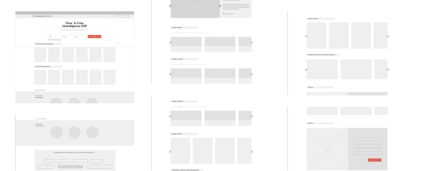
A primary action module(direct search) for the bookers with clear requirements, and deliver a loud and clear USP to everyone immediately after landing.
Design user-centred engagement modules for the lookers and nurture them in the later folds, using the values we identified as — Care, Expertise, Professionalism, and Trustworthiness (CEPT).
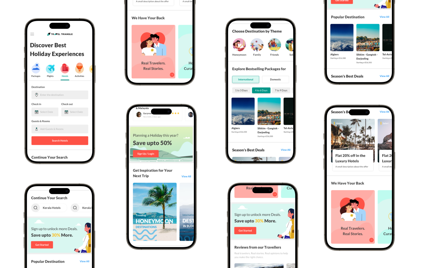
So, we did the same thing. Rather than revamping complete pages/screens on mobile-website, app or desktop-web; we started with the fonts, brand colors, success and failure colors, icons, spaces, shadows etc.
For each of these items to be finalized, it took its own design thought process which majorly comprises zeroing-in on our primary user segments, understanding their psychology, creating mood-boards for them and deriving color palette from multiple mood-boards
The previous icons lack variety and consistency, which makes them less effective in aligning with the theme. They do not sufficiently guide users or enhance their understanding of the product. To address this, the icons should be designed with the intent to support user navigation, evoke a sense of joy and adventure, and complement the overall holiday theme. The goal is to create visually appealing icons that are not only functional but also contribute to a delightful user experience.
Through a character based illustrations, we want to bring a unique communication that will improve brand value propositions and perception among the users, at the same time the illustrations will make them feel at the right place through the stories they carry.
Visit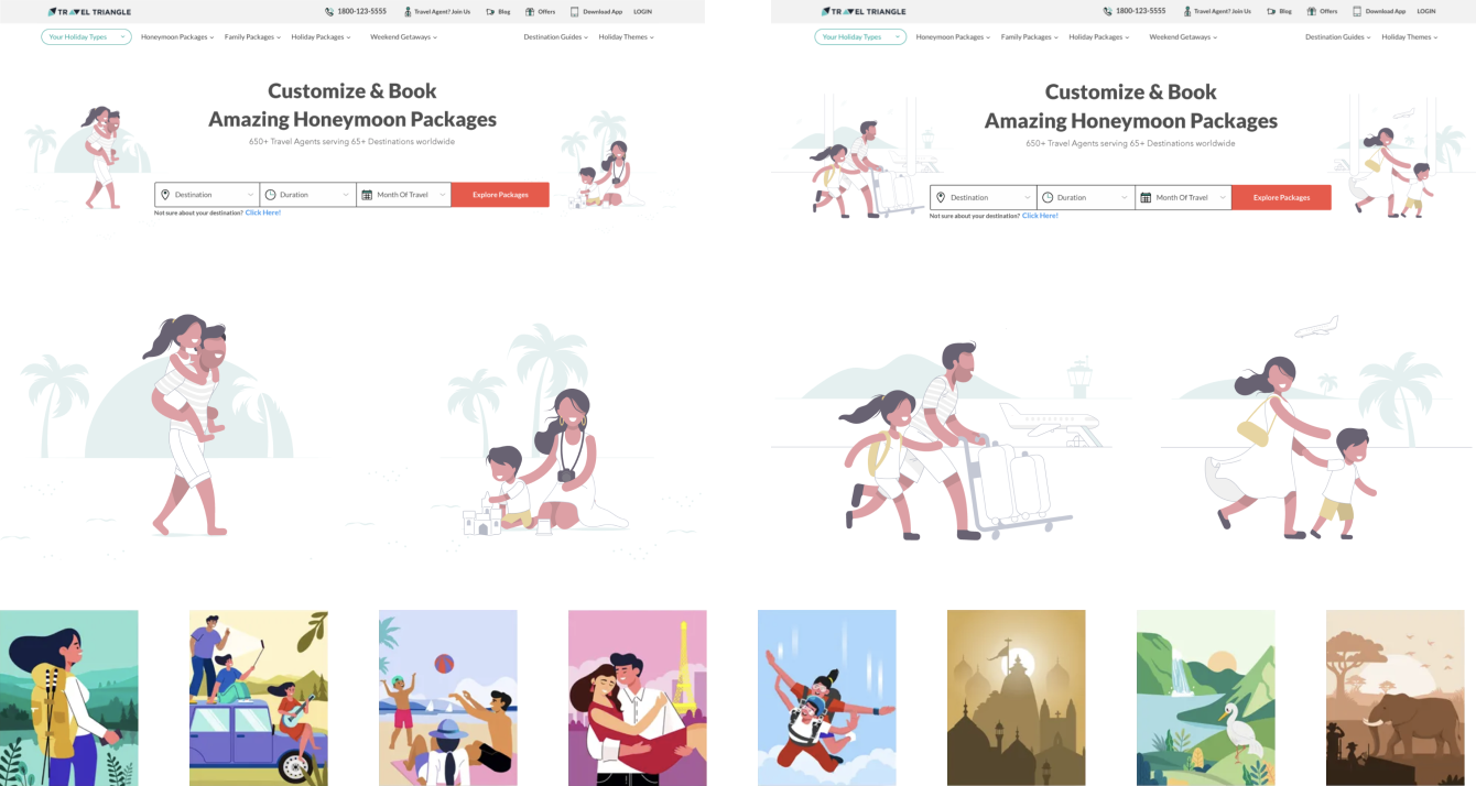
The stylesheet created for TravelTriangle ensures design consistency across platforms, fostering a unified user experience. By standardizing components, colors, and typography, it streamlines the design and development process, increasing productivity and significantly reducing development time. This efficient approach empowers teams to focus on innovation while maintaining a cohesive brand identity.
Visit