
Reduce upto by
3X
Ticket Queries
Increase by
2X
Session Duration
New Business PTL
90%
Adoption
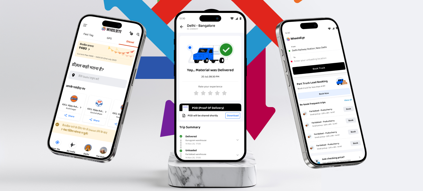
WheelsEye is committed to providing safe and top-quality goods transportation services. All our vehicles are GPS enabled, and all truck operators are KYC verified.
Visit WebsiteCore Objectives

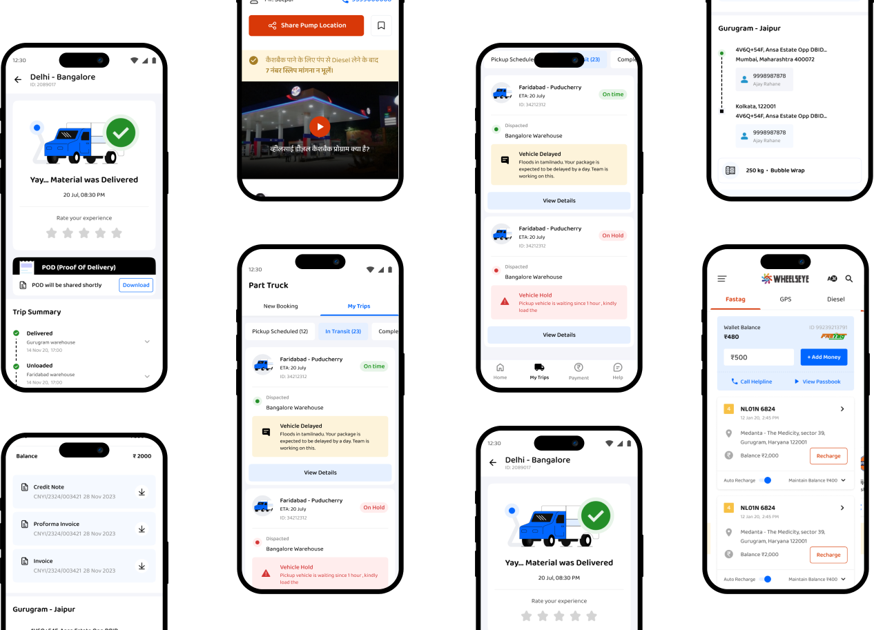
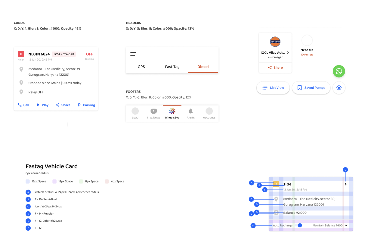
Wheelseye's new design emphasizes trust and ease of use to resonate with the trucker industry, where users may not be tech-savvy and are cautious about adopting new tools. The design choices, including fonts, icons, illustrations, etc, are made with a focus on fostering happiness and trust, ensuring the interface feels approachable, reliable, and user-friendly for this audience.
Keywords: Friendly, Rounded, Affable, Cheerful

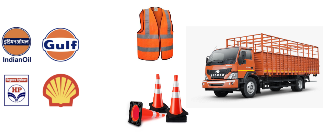
In our user surveys, we have found out that users recognise and like colours from their surroundings, both physical and digital. Earth, sky, roads, signs and their lovely trucks are those few things which clearly shows an impact on their choice. The most recognisable and liked colour was a tone of muddy orange color which also happens to be a colour widely used to paint trucks in India.

Every piece of graphics, be it icon, image, colors or shapes creates a certain mood, they
all reflect some properties of a brand. We want to create an icon style which is unique
and sets the right mood for our brand.
For our use case we think the icons should be crisp, rounded, soft and light. As the IA
of our app is text heavy and most of the icons have repetitive usages, it would also
make sense to make them light.
When you're creating a character or an illustration for your brand & for your end user. It’s really important they go with your brand & your end user relate with them. For that we need to know some questions like:
After the research we got some of our user traits. For example:

The previous icons lack variety and consistency, which makes them less effective in aligning with the theme. They do not sufficiently guide users or enhance their understanding of the product. To address this, the icons should be designed with the intent to support user navigation, evoke a sense of joy and adventure, and complement the overall holiday theme. The goal is to create visually appealing icons that are not only functional but also contribute to a delightful user experience.
Visit